How to hide sections on mobile in Squarespace 7.1
A mobile friendly website is a must have these days — It creates a better user experience, builds trust, amplifies your visibility (hello, SEO!), and so much more. Squarespace is responsive and adjusts to any device size automatically which one of our top reasons to why we recommend the platform for beginners!
Squarespace is a flexible platform that makes customization a breeze, but with one exception... the mobile view of web pages 🙄 if you know, you know. Oftentimes, the perfect layout on desktop needs work on mobile...
Luckily we can customize the mobile view by adding some simple CSS to our website. In this tutorial, we will walk you through how to hide sections on mobile in Squarespace 7.1. This tutorial is great for sections that look gorgeous on desktop, but just aren’t working on mobile.
PS. If you’d like to learn how to hide specific elements on mobile, check out this blog post!
FIRST THINGS FIRST: SECTION DATA ID’S
In this tutorial we will need to identify “data section ID’s”.
What the heck are those? Data section ID’s target the specific ID’s attached to a section of a page on your website. In this tutorial, we will be using data section ID’s to hide full sections on mobile view.
Here is an example of a data section ID: section[data-section-id=“5f80eb87697bef48c00edeeb”]
You might think this is above your pay grade, however there’s a super handy Google Chrome extension that will magically show you the data section ID for every section on your website with the click of a button. Best of all, it’s free!
Add the Chrome plugin to your toolbar, open your website, and click the grid icon on the top right corner to enable the extension. You will immediately see the block codes and ID’s for all of the sections of your site.
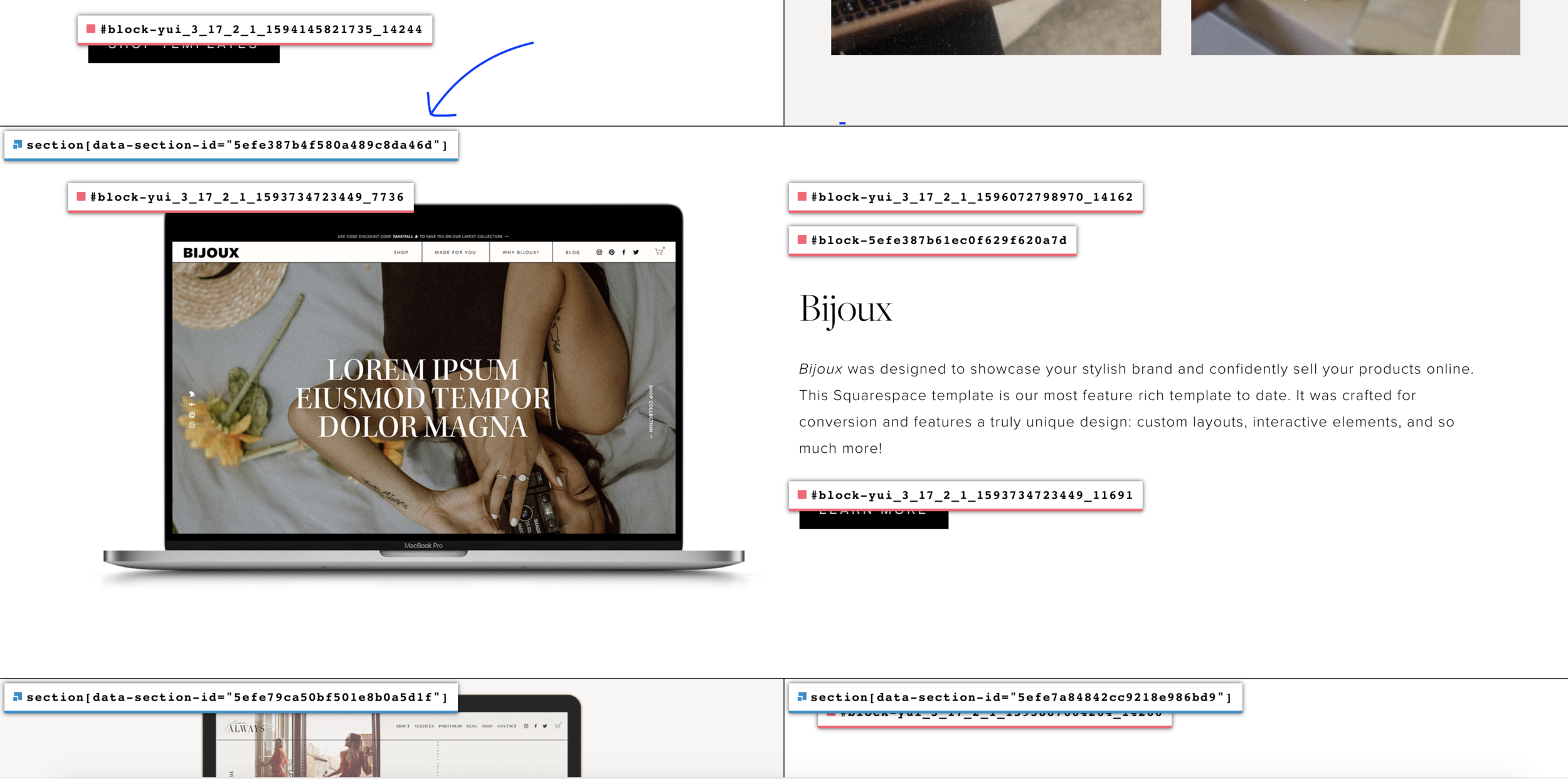
Here is a preview of the Squarespace ID Finder at work.
To find a Data Section ID, go to the top of the section you would like to hide on mobile and look for the blue sticker that reads section{data-section-id………..}.
Click on the blue sticker and the data section ID will automatically be copied to your clipboard.
THE GOOD STUFF: HIDING FULL SECTIONS ON MOBILE
Now that you know how to identify data section ID’s, let’s add the code.
Go to design > custom CSS. Add the following code:
// REMOVE SECTION ON MOBILE

@media screen and (max-width:640px) {
section[data-section-id=“5f80eb87697bef48c00edeeb”] {
display: none;
}
}
Replace section[data-section-id=“5f80eb87697bef48c00edeeb” with the section data ID for the specific section you want to hide.
Lastly, make sure to view your website on mobile to make sure the section is hidden.
Want to support us or save this post for later? Share it on Pinterest!
Disclaimer: This blog post contains affiliate links. We may earn a small commission to fund our coffee drinking habit. You will not be charged extra, and you’ll keep us supplied in caffeine. It’s a win for everyone, really.


